WordPressでChart.jsの散布図グラフを描画する方法を説明する。
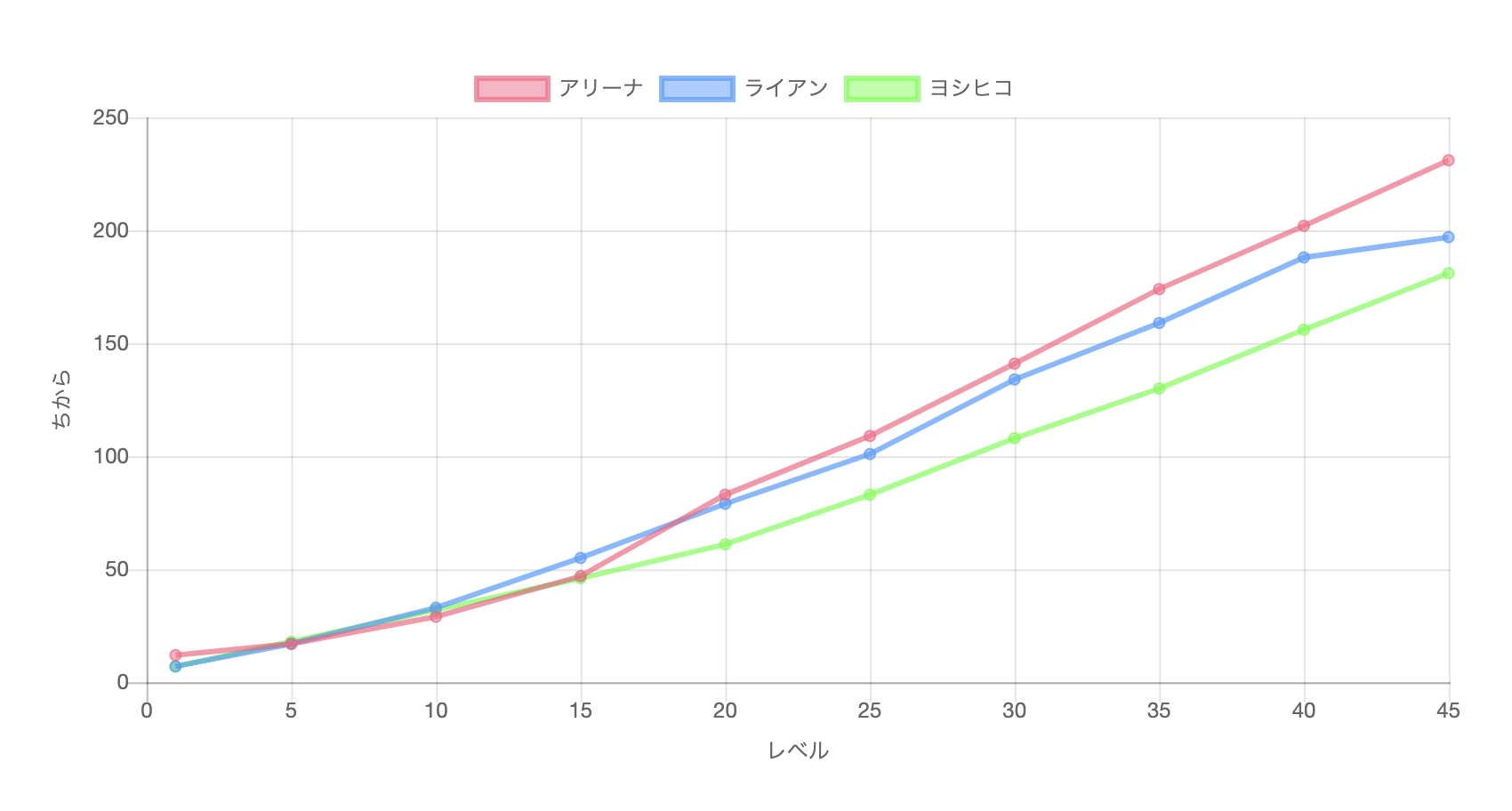
完成イメージ
アリーナ、ライアン、ヨシヒコの力の伸び方をChart.jsの散布図グラフで表してみる。
作成方法
WordPressのカスタムHTMLに下記コードを記述する。
- canvasを配置する。
- 2Dグラフィックを描画するためのメソッドやプロパティをもつオブジェクトctxを定義する。
- グラフを定義する。
- グラフのタイプをscatter(散布図)に設定する。
- グラフのデータの参照先を設定する。
- グラフのオプションの参照先を設定する。
- グラフのデータを設定する。
- グラフのオプションを設定する。
<script type="text/javascript"
  src="https://cdnjs.cloudflare.com/ajax/libs/Chart.js/2.7.2/Chart.bundle.min.js">
</script>

<div style="width:100%">
  <canvas id="canvas"></canvas>                                 <!-- 1 -->
</div>

<script>
  window.onload = function() {
    let ctx = document.getElementById('canvas').getContext('2d');    // 2
    let グラフ = new Chart(ctx, {                                     // 3
      type: 'scatter',                                               // 4
      data: グラフのデータ,                                            // 5
      options: グラフのオプション                                       // 6
    });
  };

  var グラフのデータ = {                                              // 7
    datasets:[
        {
          label: "アリーナ",
          borderColor     : "rgba(255,100,133,0.7)",
          backgroundColor : "rgba(255,100,133,0.5)",
          fill: false,                      // 横軸から線の間の色付けをしない
          showLine: true,                   // 線を描画する
          lineTension: 0,                   // スムージングしない
          pointRadius: 3,
          data: [{x: 1, y: 12},
                 {x: 5, y: 17},
                 {x:10, y: 29},
                 {x:15, y: 47},
                 {x:20, y: 83},
                 {x:25, y:109},
                 {x:30, y:141},
                 {x:35, y:174},
                 {x:40, y:202},
                 {x:45, y:231}]
        },
        {
          label: "ライアン",
          borderColor     : "rgba(55,155,255,0.7)",
          backgroundColor : "rgba(55,155,255,0.5)",
          fill: false,
          showLine: true,
          lineTension: 0,
          pointRadius: 3,
          data: [{x: 1, y:  7},
                 {x: 5, y: 17},
                 {x:10, y: 33},
                 {x:15, y: 55},
                 {x:20, y: 79},
                 {x:25, y:101},
                 {x:30, y:134},
                 {x:35, y:159},
                 {x:40, y:188},
                 {x:45, y:197}]
        },
        {
          label: "ヨシヒコ",
          borderColor     : "rgba(55,255,55,0.7)",
          backgroundColor : "rgba(55,255,55,0.5)",
          fill: false,
          showLine: true,
          lineTension: 0,
          pointRadius: 3,
          data: [{x: 1, y:  7},
                 {x: 5, y: 18},
                 {x:10, y: 32},
                 {x:15, y: 46},
                 {x:20, y: 61},
                 {x:25, y: 83},
                 {x:30, y:108},
                 {x:35, y:130},
                 {x:40, y:156},
                 {x:45, y:181}]
        },
    ]
  };

  var グラフのオプション = {                                           // 8
    responsive: true,
      scales: {
        xAxes: [
          {
            scaleLabel: {
              display: true,
              labelString: 'レベル'
            }
          }
        ],
        yAxes: [
          {
            scaleLabel: {
              display: true,
              labelString: 'ちから'
            }
          }
        ]
      }
  };

</script>
まとめ
WordPressでChart.jsの散布図グラフ(線付き)を描画する方法を説明した。


コメント